A Wake-Up Call for Ketchikan Tour Operators
The next time you check your website stats, take a look at where your traffic is coming from. If you’re in the Ketchikan tourism industry, odds are more than 70% of your visitors are browsing from a mobile device—often while on a cruise ship or ferry, between ports, or even walking the docks.
And if your website isn’t built for that experience?
You’re losing bookings.
In today’s fast-paced, mobile-driven world, a desktop-first design is no longer enough. Mobile-first design isn’t a tech trend—it’s the new foundation of successful digital marketing, especially when it comes to tour sales in Ketchikan.
Let’s break down why mobile-first design matters, how it affects your bottom line, and what you can do to make sure your website is helping—not hurting—your business.
What Is Mobile-First Design?
Mobile-first design means exactly what it sounds like: your website is designed primarily for mobile devices, not just adapted to them after being built for desktop. This includes:
- Prioritizing fast load times
- Larger text and buttons
- Easy navigation with thumbs
- Simplified booking forms
- Streamlined user journeys
Instead of shrinking a full-size site to fit a phone, mobile-first sites are intentionally designed to look and work great on small screens first, then expanded for tablets and desktops.
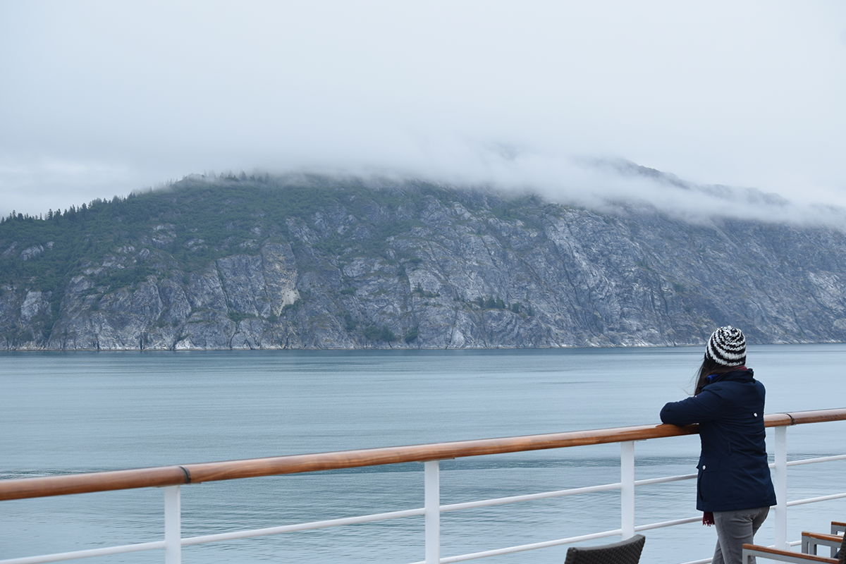
Why It Matters in the Ketchikan Tourism Industry

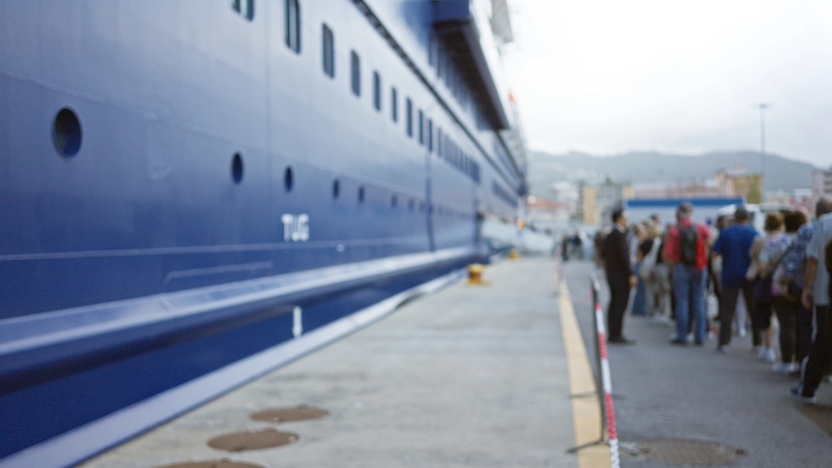
Ketchikan’s tourism market is heavily cruise dependent. Every summer, thousands of visitors arrive by ship—many of them without access to full desktop computers. They’re exploring your site while on the move:
- Booking on the fly: Many cruisers don’t book tours until they’re in route.
- Using limited Wi-Fi or data: Cruise ship internet is expensive and slow.
- Relying on mobile search: “Best Ketchikan tours near me” is a common query.
If your website is slow, cluttered, or hard to use on a phone, users will bounce—and your competitor’s mobile-friendly site will get the sale instead.
5 Ways Mobile-First Design Boosts Tour Sales
1. Faster Load Times Lead to More Bookings
According to Google, 53% of mobile users leave a site if it takes longer than 3 seconds to load. In the tourism industry, that can mean hundreds (or thousands) in lost revenue per day.
A mobile-first site is:
- Lightweight and efficient
- Built for speed with compressed images and optimized code
- Hosted on fast, secure servers
More speed = more engagement = more conversions.
2. Simplified Booking = Higher Conversions
Mobile users don’t want to pinch, zoom, or fumble through a complicated checkout process.
A mobile-first site:
- Has short, easy-to-fill forms
- Integrates with mobile-friendly booking systems
- Keeps payment secure and quick
This kind of UX (user experience) leads to more completed bookings and fewer abandoned carts.
3. SEO Rankings for Local Tour Searches

Google ranks mobile-friendly websites higher in mobile search results. Since most Ketchikan tourists are using mobile search while in port, your ranking directly impacts your visibility.
Mobile-first design helps with:
- Better mobile performance scores
- Lower bounce rates
- Enhanced local SEO with click-to-call and map integration
That means more eyes on your business when it matters most.
4. Stronger First Impressions
Travelers don’t just want a tour—they want an experience. Your website is their first impression of your brand. If it looks dated or broken on mobile, it reflects poorly on your service.
A well-designed mobile-first site:
- Instills trust
- Builds excitement
- Creates a sense of professionalism
And yes, trust translates into more confident bookings.
5. Improved Accessibility and Reviews
When users can easily find your info, read your content, and interact with your brand on mobile, they’re more likely to leave positive reviews and recommend your tours to others. That’s especially important in a tourism-heavy town like Ketchikan, where word-of-mouth and TripAdvisor reviews are king.
What to Check Right Now
Not sure if your website is mobile-first? Here are a few quick things to test:
- Does your homepage load in under 3 seconds on mobile data?
- Are your call-to-action buttons large and easy to tap?
- Is text readable without zooming?
- Is your booking form visible and functional on a phone?
- Can you click to call or get directions from a mobile device?
If you answered “no” to any of these, you’re likely losing business.
How Bold Marketing & Design Can Help
At Bold Marketing & Design, we specialize in helping Ketchikan tourism businesses thrive online. Our custom mobile-first websites are:
- Optimized for tourist behavior on-the-go searches, quick booking, location-based info
- Designed with conversion in mind featuring clear CTAs, streamlined UX, local SEO structure
- Fast, responsive, and beautiful on every device
Whether you run a zipline adventure, wildlife tour, fishing charter, or walking tour, we can design a website that turns mobile clicks into confirmed sales.
Don’t Let a Bad Mobile Site Cost You Bookings

Your website should work where your customers are—and they’re on their phones.
Tourism in Ketchikan is competitive, and mobile-first design isn’t optional anymore. It’s the difference between someone clicking “Book Now” or moving on to the next option.
Contact us today to discuss a custom-built, mobile-first website for your tourism business.
Let’s make sure your website works as hard as you do this tourist season.